
by Roseanna White | Jun 13, 2018 | Books, What We're Reading
A couple of weeks ago, I posted a question on Facebook, asking for audiobook recommendations. I thought it would be handy to compile the list I received before they get swallowed by Facebook history and impossible to find. 😉

I’ve never been a big audiobook listener. Up until now, I’ve listened to exactly two full works, and one partial. The two successful ones I listened to while knitting. The partial, I was just trying to get a handle on an accent and the accompanying spelling, so I just needed to compare the two for a few chapters. Which was all I could handle. Because I read fast, and the narrator, while very talented, read
s-l-o-w, and I couldn’t handle it for long. I am not patient with such things, LOL.
In addition to my impatience, I also am rarely alone in a quiet environment. As in, one without interruptions. It never seemed feasible to really get any good listening in, when interruptions meant having to press a button and then find my place again, rather than just looking up from a page.
But here’s the thing. I told myself I was going to exercise more regularly this summer and (hopefully) create a good habit. But I hate exercise. I mean, seriously. It always feels like a time drain, drudgery, useless. I can enjoy walking, but I don’t have many places I can walk where I live. So I decided I would have to treat it like folding laundry, one of my other dreaded tasks–give myself something to look forward to. For laundry, that meant a TV show on Netflix or Prime that I picked out, just for me. (Unprecedented in my house, LOL. Usually, if someone hands me the remote, I just turn the set off.)
It worked for laundry. I now actually look forward to folding. I’ve watched the complete series of White Collar and Gilmore Girls like this, and now I’m just having fun with Say Yes to the Dress. So I’ve been experimentally using audio books as the same sort of incentive for exercise. And thus far, for the past two weeks, it’s been working like a charm!
My first book selection was based mainly on my Library’s limited Overdrive selection of Christian fiction. They had exactly 11 that were labeled such. Seven of which were Amish fiction, which isn’t my preference. Two others of which I’ve read. That sure narrowed down the choices! So I ended up selecting one I’ve long wanted to read–have on my shelf, as a matter of fact, in paperback, but never got around to. Pearl in the Sand by Tessa Afshar. I’ve chatted with Tessa and greatly admire her, but I’d yet to pick up one of her books! Bad, Roseanna!
And it’s been amazing. Love it, and I can definitely see why she’s such a popular Bib-fic author! But I’ll be finishing it up in the next day or two, so it’s time to select my next read, hence revisiting the list of recommendations.
Here’s what’s come in already. I’d love to hear your rec’s, if they’re not already on there, and just to share these with you in case you’re also on the hunt!
I’ve divided these into genres…though I was working quickly, so if anything is mis-filed, don’t sue me. 😉 I didn’t divide out YA, and these are a mix of Christian and mainstream titles. I know that listening methods vary, so the links below will take you the book’s Goodreads page.
The Guernsey Literary and Potato Peel Pie Society by Mary Ann Shaffer, Annie Barrows
SPECULATIVE/SUPERNATURAL/SCI-FI/FANTASY
What is your favorite Audiobook?

by Bookworm Mama | Jun 6, 2018 | Books, Giveaways and Contests, What We're Reading
Summer is just around the corner! I am excited to have a break from homeschooling for a little bit and although I will be writing like a madwoman to meet deadlines, I hope to squeeze in some much-needed reading time as well.
Whether you are taking road trips, hanging by the pool, or escaping to the lake this summer…Here are a few books that I HIGHLY recommend you take along with you. I have included links to purchase each book. Don’t forget to check out sites like
Audible,
Christian Audio, and
SCRIBD for access to Audiobooks, ebooks, and more (free trials are great!).
A Light on a Hill
by Connilyn Cossette
“This is biblical fiction at its finest! Engrossing, engaging, and stunningly written.” Roseanna
Seven years ago, Moriyah was taken captive in Jericho and branded with the mark of the Canaanite gods. Now the Israelites are experiencing peace in their new land, but Moriyah has yet to find her own peace. Because of the shameful mark on her face, she hides behind her veil at all times and the disdain of the townspeople keeps her from socializing. And marriage prospects were out of the question . . . until now.
Her father has found someone to marry her, and she hopes to use her love of cooking to impress the man and his motherless sons. But when things go horribly wrong, Moriyah is forced to flee. Seeking safety at one of the newly-established Levitical cities of refuge, she is wildly unprepared for the dangers she will face, and the enemies–and unexpected allies–she will encounter on her way. (Amazon)
If I Run Series
by Terri Blackstock
“Powerful and riveting! I loved each installment, and the series ended with a bang!” – Roseanna
Casey knows the truth.
But it won’t set her free.
Casey Cox’s DNA is all over the crime scene. There’s no use talking to police; they have failed her abysmally before. She has to flee before she’s arrested . . . or worse. The truth doesn’t matter anymore.
But what is the truth? That’s the question haunting Dylan Roberts, the war-weary veteran hired to find Casey. PTSD has marked him damaged goods, but bringing Casey back can redeem him. Though the crime scene seems to tell the whole story, details of the murder aren’t adding up. Casey Cox doesn’t fit the profile of a killer. But are Dylan’s skewed perceptions keeping him from being objective? If she isn’t guilty, why did she run?
Unraveling her past and the evidence that condemns her will take more time than he has, but as Dylan’s damaged soul intersects with hers, he is faced with two choices. The girl who occupies his every thought is a psychopathic killer . . . or a selfless hero. And the truth could be the most deadly weapon yet. (Goodreads – If I Run)
Across the Blue
by Carrie Turansky
“I’m thoroughly enjoying this charming and delightful glimpse of aviation in its early days.” – Roseanna
Set in Edwardian England and ideal for readers who enjoy Julie Klassen novels, this romance about an English aviation pioneer and the girl who falls in love with him is filled with adventure and faith.
Isabella Grayson, the eldest daughter of a wealthy, English newspaper magnate, longs to become a journalist, but her parents don’t approve. They want her to marry well and help them gain a higher standing in society. After she writes an anonymous letter to the editor that impresses her father, her parents reluctantly agree she can write a series of articles about aviation and the race to fly across the English Channel, but only if she promises to accept a marriage proposal within the year. When James Drake, an aspiring aviator, crashes his flying machine at the Grayson’s new estate, Bella is intrigued. James is determined to be the first to fly across the Channel and win the prize Mr. Grayson’s newspaper is offering. He hopes it will help him secure a government contract to build airplanes and redeem a terrible family secret. James wants to win Bella’s heart, but his background and lack of social standing make it unlikely her parents would approve. If he fails to achieve his dream, how will he win the love and respect he is seeking? Will Bella’s faith and support help him find the strength and courage he needs when unexpected events turn their world upside down? (Goodreads)
Giveaway
In honor of these fabulous books, I am giving away a PRINT copy of Across the Blue to ONE lucky winner!
Giveaway ends 6/12/18 at 11:59pm EDT
Open to US mailing addresses only. Void where prohibited.

by Roseanna White | Jan 24, 2018 | Books, Cover Designs
Time for another peek behind the cover design process! This time, I’m featuring one that won’t be all that involved. As designs go, it was pretty simple. Which is why I’m featuring it today, as I’m short on time. 😉
Rachel McMillan is best known for her historicals, but she occasionally puts on a contemporary novella, and I’m always thrilled when she comes to me for the cover. =) Last year I designed a cover for a Christmas novella duo in which she and Allison Pittman each wrote a story.
This year, Rachel has Love in Three Quarter Time releasing on Valentine’s Day.
Her wants were pretty simple. The heroine, face not visible, and Vienna in the background. She gave me some great photos for inspiration and even the name of a few buildings she’d like to see on the cover. And as a comparable cover, she recommended this (and other covers for Carla Laureano):
Armed with nice, decisive information like this, I hit Shutterstock with confidence. It’s always so much easier to design a cover when the author knows exactly what they want!
My first hunt was for a model that fit the description of Rachel’s main character. Rachel described her as having shoulder length dark hair, cut in a curly bob. She tends to wear turtleneck sweaters, knee high boots, tweed, cardigans…”classic librarian.” I went searching for such lovely ladies with their faces averted and happened pretty quickly upon this one.
Not bad! Happy with that as a starting place for Evelyn, I next turned to images of Vienna. Anything from historical Vienna would do, but I began by looking for images of the Staatsoper (opera house), upon Rachel’s recommendation. And there were some GORGEOUS photos of this building at sunset. This is the one that caught my eye.
Putting the two together was pretty simple. The only real tweaks I had to make were to delete a few flyaway hairs and add some lighting to the model, which gave me this.
I wanted to punch the lighting up a little bit though, so I added the Hudson filter…
Satisfied that this was a good base, I added some faded color layers to give me a good place for the words…
And then added the title and author. Now, I’d just purchased this super-gorgeous font called Monstera that I was dying to use…especially since I’d FINALLY figured out how to access all the pretty alternates (I’m embarrassed by how long it took me to actually read the how-to included with all these fonts I’ve downloaded. For reference, on a PC, hit the Start button and type “Character Map.” Click on that, and up will pop a screen like this…
Just click on the version of the letter you like, click Select, and then Copy, and paste directly into where you want to use it–in my case, the text layer in Photoshop. Ridiculously simple.)
So as you can see in the image above, I played around with the various forms of each letter until I landed on this.
This was almost, almost there. But I wanted a little something more. A flourish. Something to pull the music theme of the title (Vienna is where the waltz originated) into the cover. So I found this pretty little musical flourish…
I put my choice of this set behind the title, and it added just the touch I was looking for! I showed it to Rachel, and she declared it exactly what she was looking for. Yay! So here’s the final:
So here’s some more about the story.
A romantic waltz through a city filled with music, passion and coffee.
Evelyn
Watt fell in love with Austrian marketing director Rudy Moser the
moment he stepped into their Boston firm. With his ice blue eyes and
chocolate-melting accent, he is as refined as she imagines his home
country to be. When Evelyn finds herself unexpectedly unemployed right
before Christmas, she is left with an unknown future until Rudy steps in
with a job appraising, assessing and cataloging heirlooms, lending her
American vernacular to the translated descriptions to give each item
international appeal. Evelyn will live in Vienna for the months leading
up to a grand auction at a party held in conjunction with the Opera
Ball—on Valentine’s Day.
Vienna is a magical blend of waltzing,
antiques, and bottomless cups of Einspanner coffee at the Café Mozart.
When a secret from Rudy’s family’s past blows in with the winter chill,
Evelyn is forced to confront how well she knows the object of her
affection. Her café tablemate, the gruff and enigmatic Klaus Bauner
might be the only person who holds the key to Rudy’s past. But could
that key also unlock her future? In the days leading up to the Opera
Ball, Evelyn finds herself in the middle of the greatest romance of her
life…as long as she doesn’t trip over her two left feet.
You can pre-order this from Amazon now, and it’ll download to your Kindle on 2/14!
What do you think of the cover? Do you like the feel? The setting, the face-averted heroine?

by Roseanna White | Sep 27, 2017 | Books, Cover Designs
It’s been a while since I’ve gone behind the design of a book cover…and since someone asked me about it last week, I figure it’s time for another example. But what cover should I feature?? Always a question–and since I can’t always release a cover publicly when I design it (gotta wait for the author to do so, after all), I’m not always sure when I can feature a cover.
But in this case, there’s no question as (a) it’s a WhiteFire book and (b) it releases October 15! So today we’re going to take a look at Melody Carlson’s String of Pearls, the third book in the Mulligan Sisters Series.
Let’s start by looking at the first two books in the series.
As you can see, we have a theme established for the series. In the foreground we have one of the sisters–starting with Bridget, who joins the Army Nursing Service at the beginning of WWII, and then moving to Colleen in book 2, whose dreams get all tangled up in heartache as she pursues a Hollywood career. In the background of each book, I used a public domain era photograph which I colorized.
On book 3, we knew we wanted Molly, the youngest of the 4 Mulligan sisters. Molly looks a lot like Colleen, so my first challenge was going to be finding a model who could look like the sister of #2. I tried a few different girls but ended up using this one.
Of course, the body wasn’t right–but I liked the face. She bears a nice resemblance to the model for Colleen, coloring’s right, and I loved her smile. And I had already scoped out an image of a 40s style woman with a camera–and Molly loved photography.
I started by just putting the blond’s head as-is on the brunette’s body, but Melody requested some more 40s style hair. So I took this lovely lady’s curls…
Lightened and brightened them, put them on the first blonde’s head, and plunked them both on the brunette’s body, to get this.
But I didn’t want to keep the same coloring on the clothes–especially since I’d recently used another shot of the brunette in a different cover and preserved that red sweater in that one. Here, I decided to go with blue. So I copied the sweater and the skirt, made them new layers, and used the Hue/Saturation option to change them to blue.
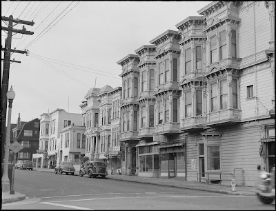
But what to use as a backdrop? I tried a few modern photographs behind her–shots of San Francisco streets. But modern photographs just don’t look the same as 1940s photographs, and it gave the cover a whole different feel from the first two books. So I went hunting for photos I could use from the 1940s and eventually found this one.
The only problem with this is that it was going the wrong direction–I needed my lines pointing at my model, not away from her, in order to balance the image correctly. Now, flipping an image is easy-peasy…until you realize that there are signs which are then backwards. *Sigh*. But I just flipped and resized all of those as well.
Then the tricky part–colorizing it. This isn’t my forte, but I’ve been learning how to do it. In general, the method is to create a new layer, set said new layer to a different blending mode–often Overlay, though occasionally a different option works better, just depending on the color being used.
Now, I didn’t bother colorizing the whole photo, just the part visible behind Molly. So it looks a little funny like this, LOL.
I referred to the modern photos of this street to get some color inspiration for the houses, and chose red for the car because it would show up nicely against the dark tones of the black and white photo, and also provide a little pop of color.
Of course, we needed a beautiful sky. Each of the first two books had very bold, rich skies. So I searched for a photo of San Francisco with a gorgeous sunset sky and found this one.
So putting that behind the blank sky of the city, and it all behind Molly, we arrive at our basic design.
The title and series were already designed, so it was a pretty simple matter of plugging those in and adding some shading behind them to make everything stand out. I chose red for the title, echoing that pop of it from the car and the sign. My final step was to add a photo filter action to draw it all together and add a bit more depth to the colors. In this one, I used X-Pro (a filter Instagramers will recognize.) And there we have the finished cover!
So what do you think? Do you like the style that mixes old photos with new? Do you have a favorite from the series?
And if you’re a Melody Carlson fan, definitely go snatch these up! They’re a really interesting look at WWII through a family on the home front.

by Roseanna White | Sep 19, 2017 | Books, Giveaways and Contests
Quick post today to tell you all to check out an amazing giveaway hosted on Suzanne Woods Fisher’s blog, celebrating historical fiction. She has 10 authors on for 10 days! I’ll be up on Friday. In the meantime, be sure to check out these other awesome authors!
Hop on over!
Also, Relz Reviews has a giveaway of A Name Unknown going on right now, along with a fun character spotlight of both Rosemary and Peter (by popular demand, LOL).
Visit Relz Reviews

by Roseanna White | Aug 9, 2017 | Books, Cover Designs
Are you a member of the Band of Booksters yet?
If so, you get to vote today on new cover choices. If not . . . sign up here, request to be added to our Facebook group so you can chat with this amazing team of book lovers. THEN cast your vote. 😉
Today’s survey is deciding between two new styles for WhiteFire’s first series. When Shadowed in Silk first released, thumbnail images weren’t quite the King of Sales they are now (or at least, we didn’t realize they were). Now that we know how important it is for title and author to be legible in that small size, we’re giving the books in the series a facelift.
Remember these award-winning books?
We’ve come up with two new options for them. The first keeps the same models, but fades their face only into an Indian background.
The second version doesn’t use photographs at all, but rather goes with a graphic style that focuses on the title and the color–choosing colors to correlate with the originals.
I won’t be posting much more from the Band of Booksters on my blog, but as it’s still so new, I want to give you a peek at what sort of thing you can expect, if you haven’t signed up already. 😉 And if you have but didn’t receive our newsletters last week, then check your spam folders and add us to your approved list! We’d love to have you join us on Facebook, where the discussions are already great.
Already a member, or have just requested to join? Then cast your vote for the covers!

 I’ve never been a big audiobook listener. Up until now, I’ve listened to exactly two full works, and one partial. The two successful ones I listened to while knitting. The partial, I was just trying to get a handle on an accent and the accompanying spelling, so I just needed to compare the two for a few chapters. Which was all I could handle. Because I read fast, and the narrator, while very talented, read s-l-o-w, and I couldn’t handle it for long. I am not patient with such things, LOL.

 Some Wildflower in My Heart by Jamie Langston


 Roseanna M. White is a bestselling, Christy Award winning author who has long claimed that words are the air she breathes. When not writing fiction, she’s homeschooling her two kids, editing, designing book covers, and pretending her house will clean itself. Roseanna is the author of a slew of historical novels that span several continents and thousands of years. Spies and war and mayhem always seem to find their way into her books…to offset her real life, which is blessedly ordinary.